 Originally
published
on
04/30/03
Originally
published
on
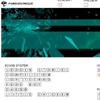
04/30/03For those of us who love to play, Jean-Luc Lamarque and Jean-Christophe Bumoux's Pianographique is not to be missed. Lamarque and Bumoux have assembled a stellar troupe of multimedia artists to create an audio-visual instrument controlled via keyboard. Among this troupe, such luminaries as Nicholas Clauss--whose shockwave work has seduced many in the net art community for years--stand out; rapper NKO contributes some dope rhymes in "Rude Boy," and musicians (Jantoma, Serge de Laubier) and visual artists (Jerome and Xavier Pehuet) abound. The result of this collaborative mix is a gorgeous online instrument that will release your inner artiste.
Be warned: this piece is highly addictive, and, once encountered, you will find yourself jamming for hours.
:: Lewis LaCook ::
 Originally
published
on
04/30/03
Originally
published
on
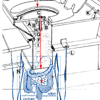
04/30/03The "complex net art diagram" created by Abe Linkoln (not his real name I'm guessing) which is a remix of the "simple net art diagram" created by mtaa in 1997, should be taken with (I hope) the lightness it has been created with. Yet saying this does highlight some interesting aspects of both net.art and modern culture in general, namely that modern culture (we are talking since the begining of post-modernism here) is a remixed version of everything else that has gone before. No longer does uniqueness play such an important role in what we create as artists (certainly new media artists) as opposed to the documentation of everything and different means of presenting this finite set (granted a large finite set) of elements, whether that be code, music, colour etc.
:: Garrett Lynch ::
 Originally
published
on
04/29/03
Originally
published
on
04/29/03Currently at Turbulence.org, guest Curator Erik Salvagio interviews the next generation of net artists or (as he refers to them ) Duchamp's Ideal Grandchildern; They are Cory Arcangel, Kalx.com, Geoff Lillemont, and Michael Mandiberg. Here is part of Salvagio's press release statement:
"It was Vuk Cosic who said that net.artists were Duchamp's Ideal Children. I should be clear. This collection is not called Duchamp's Ideal Grandchildren. There are several reasons for this important distinction of terms. For one, it is a collection of interviews and some new work with artists who are under 25 and working with the web, or in the tradition of the web. We are the descendants of JODI, of Vuk Cosic, Heath Bunting, and Alexei Shulgin, even though many of us were working at the same time. But, it doesn't matter; for the sake of compliance with the established histories of heroic? net.art, we will say simply: Here is a sampling of the next?(current) generation of internet artists."
The interviews are actually interesting. But as I often do, I have a bone to pick with much that is recommended on Net Art Review (a.k.a. criticism). I must admit that the introductory essay when read as a whole exposes an overt craving for historization, specifically in alignment with a heroic hierarchical art stance; something that at some point may run into conflict with the inherent decentralized community-based net-art practice. Nevertheless, this is a comment on the curatorial position and should not cloud what the net artists have to say. The talent whose brains are picked have made important contributions to the net-art community, and I do recommend reading the reviews with great care.
:: Eduardo Navas ::
 Originally
pubished
on
04/24/03
Originally
pubished
on
04/24/03Christina McPhee has created a series of esoteric 'browerscapes' consisting of background images combined with shockwave files. Poetry is also part of the environmental compositions. The rectangular background patterns and shockwave animations present viewers with an environment ready to be explored by scrolling up and down (feels more like walking).
McPhee considers her website to be dealing with cyberpresence. Though it may be hard to know what exactly the term may mean for the artist, it becomes obvious that she aims to explore the idea of landscape as a linguistic form of communication -- the scattered poetry can be considered a hint for such an interest. Unlike a typical landscape, McPhee's work presents flat squarish areas that defy their own boundaries by claiming a grid pattern as a way of expanding beyond what the browser is able to offer at one time.
:: Eduardo Navas ::
 Originally
published
04/24/03
Originally
published
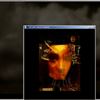
04/24/03"Either Side of an Empty Room" is a video project by Peter Horvath that has recently been featured as part of the Studios section of turbulence.org and is now also being exhibited at IMOMA's net.art open 2003.
Normally, I refuse point blank to review video (in the strictest sense of the word) as part of net art, but I feel this deserves a place with its relatively well streamlined (and hence paced) content. It's not video in the sense of one frame, one style and certainly one format, with its popup multi-windowed presentation taking lessons from net art devotees such as Jimpunk and on the cinema side of things Mike Figgis. It's easy to see the artist has a desire to work within the network, yet not suffer from the classical file-size restrictions, and how he has negotiated a balance between what normally are (due to technical reasons) opposing fields.
Visually, the project is stunning but I do fault it on a few points. Those darn popups sometimes just aren't big enough and you have to interact (quelle horreur!) to resize the windows. And, the only interactive section which contained a form fell over straight away and gave an error page right in the middle of viewing the project.
:: Garrett Lynch ::